In store signage ideas
 Here are some ideas for store signage examples that can help attract attention, convey messages, and enhance the overall shopping experience for customers:
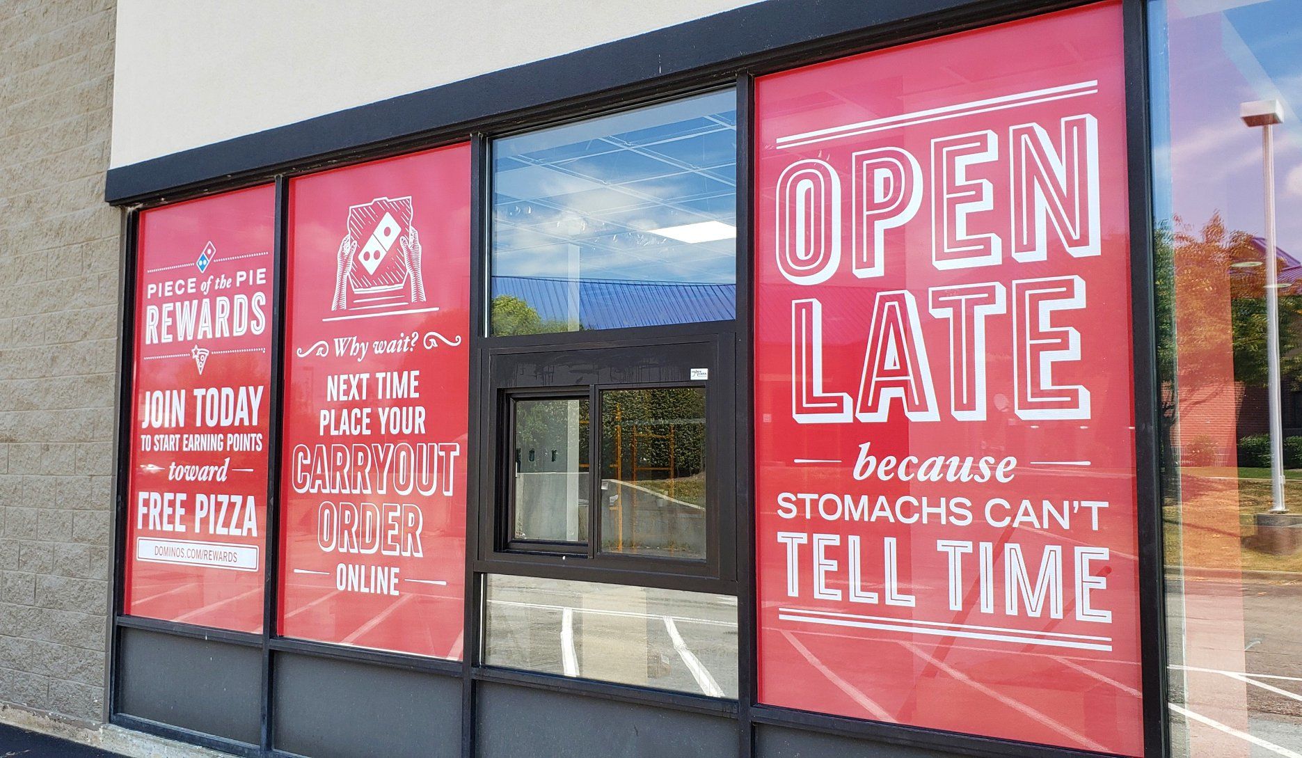
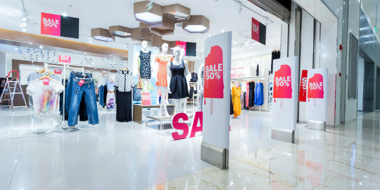
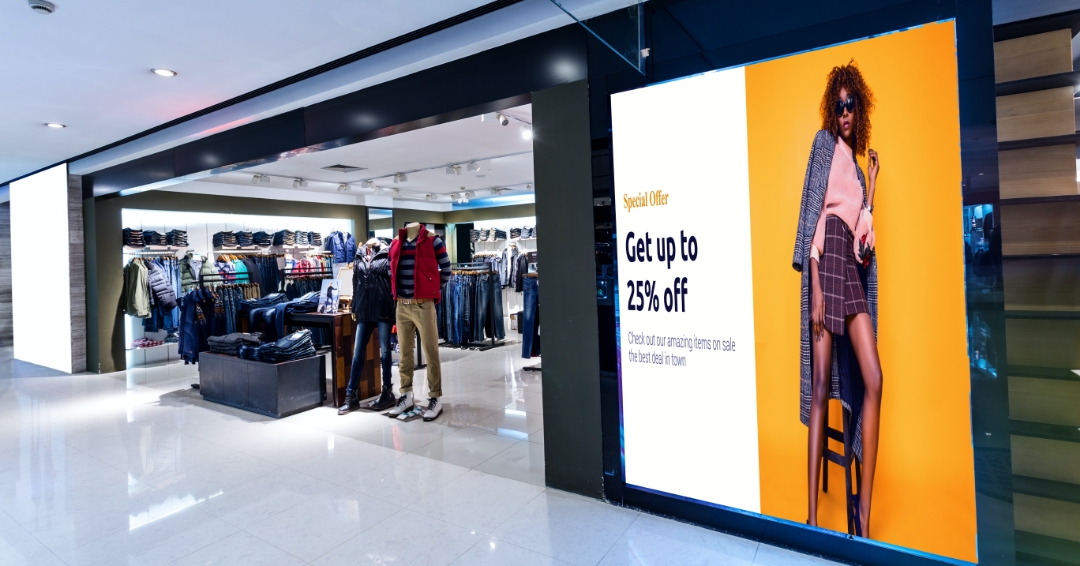
- Promotional Signs: Create eye-catching signs that promote sales, discounts, or special offers. Use bold fonts, bright colors, and compelling graphics to grab attention and encourage customers to take advantage of the promotion.
- Directional Signs: Help customers navigate your store by using signs to indicate different sections or departments. Clear, easy-to-read signage can guide customers to specific areas they are looking for, such as “Men’s Clothing,” “Home Decor,” or “Clearance Section.”
- Product Information Signs: Provide detailed information about your products with signs that highlight features, benefits, or pricing. This can help customers make informed purchasing decisions and reduce the need for staff assistance.
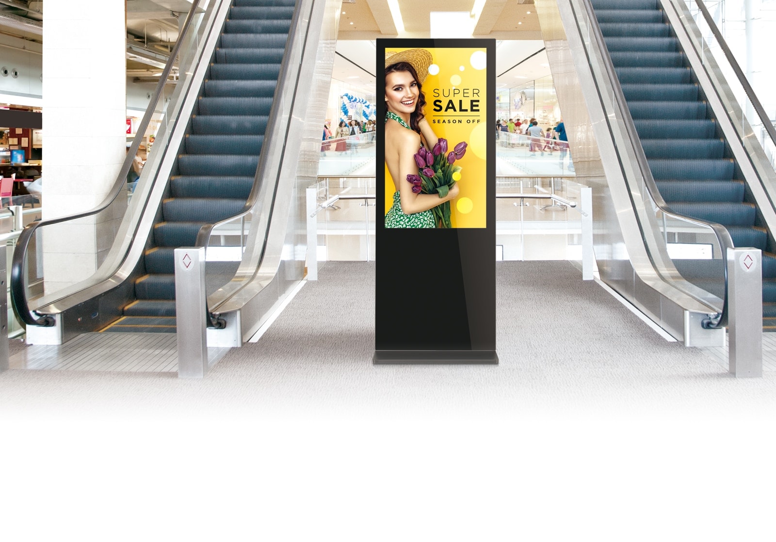
- Interactive Signs: Use interactive signs, such as touchscreens or QR codes, to engage customers and provide them with additional information, product demonstrations, or even access to online ordering options.
- Branding Signs: Reinforce your brand identity with signage that incorporates your logo, tagline, and other brand elements. Consistent branding across your store can create a cohesive and memorable shopping experience for customers.
- Seasonal Signs: Create seasonal-themed signage to celebrate holidays, seasons, or special events. This can help create a festive atmosphere and encourage seasonal shopping.
- Social Responsibility Signs: Highlight your store’s commitment to social responsibility, sustainability, or community involvement with signs that convey your values and initiatives. This can resonate with socially-conscious customers and differentiate your store from competitors.
- Safety Signs: In today’s world, safety is a top priority. Use signs to communicate safety guidelines, such as wearing masks, practicing social distancing, or sanitizing hands. This shows your commitment to customer safety and can help build trust.
- Testimonials or Reviews: Display positive customer testimonials or reviews as signs in-store. This can build trust and credibility with customers and encourage them to make purchases.
- Chalkboard or Whiteboard Signs: Use chalkboard or whiteboard signs to showcase daily or weekly specials, promote limited-time offers, or share messages in a creative and interactive way.
Remember, when designing retail store signs, it’s important to keep it visually appealing, easy to read, and aligned with your brand image. Consider the store layout, customer flow, and overall aesthetics to create effective signage that enhances the shopping experience for your customers.
 In store signage meaning
In-store types of signage refers to the visual displays or graphics used within a physical retail or business location to convey information or messages to customers. These signs are typically designed to attract attention, provide directions, convey promotions, display pricing or product information, and enhance the overall shopping experience for customers. In-store signage can come in various forms, such as window displays, aisle signs, shelf talkers, banners, posters, floor graphics, and digital signage. The meaning of in-store signage may vary depending on the specific context or content of the sign, but it generally serves as a way for businesses to communicate with customers and influence their purchasing decisions. Effective in-store signage can help create brand awareness, drive sales, and enhance the overall customer experience in a retail environment.
Store signage examples
 Here are some examples of retail shop signage:
- “SALE!” – A bold and attention-grabbing sign commonly used to highlight discounted items or promotions.
- “NEW ARRIVALS” – A sign that lets customers know about newly arrived merchandise, enticing them to explore and shop the latest products.
- “CLEARANCE” – A sign indicating a clearance sale or discounted items to encourage customers to take advantage of limited-time offers.
- “OPEN” – A simple and essential sign that lets customers know the store is open for business.
- “CLOSED” – A sign used to inform customers that the store is closed, usually displayed outside of business hours.
- “20% OFF” – A sign indicating a specific percentage discount on selected items, encouraging customers to make purchases.
- “FREE GIFT WITH PURCHASE” – A sign promoting a free gift or bonus item that customers can receive with a qualifying purchase.
- “LIMITED TIME ONLY” – A sign that creates a sense of urgency, informing customers that a promotion or offer is only available for a limited duration, encouraging them to act quickly.
- “SALE ENDS SOON” – A sign indicating that a sale or promotion is ending soon, motivating customers to make a purchase before it’s too late.
- “TRY BEFORE YOU BUY” – A sign inviting customers to test or sample products before making a purchase, enticing them to try and potentially buy the product.
Remember that the design, size, color, and placement of store signage can vary depending on the store’s branding, target audience, and marketing strategy. It’s important to consider the overall aesthetic and messaging of your store signage to create an impactful and cohesive in-store experience for your customers.
Store signage mockup
 Here’s a step-by-step guide on how to create a store signage mockup:
Step 1: Decide on the dimensions and shape of your store signage mockup. Is it a vertical banner, a horizontal sign, or a circular logo? Determine the size and shape of your mockup based on the intended use and location of the signage.
Step 2: Choose a background for your mockup. You can use a blank canvas or a stock photo of a store or outdoor environment that closely resembles the intended location of the signage. Make sure the background complements the design and message of the signage.
Step 3: Create the text for your store signage. Decide on the wording, font, size, and color of the text based on the branding and messaging of your store. Use a design software such as Adobe Photoshop, Illustrator, or Canva to create the text elements.
Step 4: Add any additional design elements to your mockup, such as logos, images, or graphics, that are relevant to your store and the intended message of the signage. Consider the overall visual hierarchy and balance of the design to ensure it is visually appealing and effective.
Step 5: Arrange the text and design elements on the background to create your store signage mockup. Experiment with different layouts and compositions to find the one that best conveys your intended message and visually captures the attention of viewers.
Step 6: Review and fine-tune your mockup. Check for any spelling or grammar errors, ensure that the text and design elements are visually aligned and balanced, and make adjustments as necessary to achieve the desired look and feel.
Step 7: Save your store signage mockup in a format that is suitable for your intended use, such as JPEG or PNG. You can also export it as a PDF if you need a printable version.
Remember, mockups are a great way to visualize how your store signage will look in real-life, but they are not the final product. Make sure to consult with a professional graphic designer or printer for the actual production of your store signage to ensure it meets quality and industry standards.
 Store room signage
- “Store Room: Authorized Personnel Only”
- “Restricted Access: Store Room”
- “Storage Area: No Unauthorized Entry”
- “Store Room: Keep Closed at All Times”
- “Authorized Personnel Only: Store Room”
- “Storage Area: No Entry Without Permission”
- “Restricted Area: Store Room”
- “Store Room Access Limited to Staff”
- “Private Storage: Authorized Personnel Only”
- “Store Room: No Entry Without Proper Clearance”
When creating storefront signs, it’s important to consider the specific rules and regulations of your location, as well as any relevant safety or security protocols. Use clear, easy-to-read fonts and contrasting colors for maximum visibility. Also, consider using pictograms or icons to reinforce the message, especially for multilingual or diverse environments.
Front store sign
 Here are a few suggestions for retail signage:
- “The Emporium: Where Quality Meets Style”
- “Chic Boutique: Your Fashion Destination”
- “Urban Outfitters: Trendsetting Fashion & Accessories”
- “Belle’s Beauty Boutique: Your Glamour Haven”
- “Sports Central: Gear Up for Victory!”
- “Pet Paradise: Where Pets are Family”
- “Gourmet Delights: Fine Foods for Discerning Tastes”
- “Book Haven: Explore the World of Words”
- “Artisan Alley: Handcrafted Treasures Await”
- “Tech Haven: Cutting-Edge Gadgets and Electronics”
Remember to consider your store’s branding, target audience, and the overall theme or concept of your store when designing your front store sign. It’s important to create a sign that reflects the personality and essence of your store while also being eye-catching and memorable to attract customers.
Store Signage Examples: Frequently Asked Questions (FAQs)
- How can I make my store signage more appealing to customers? Enhance appeal by incorporating vibrant colors, clear fonts, and strategic placement to grab attention.
- What role does signage play in brand identity? Signage is a powerful tool to reinforce brand identity, conveying the essence of your brand to customers.
- Are digital signs suitable for small businesses? Absolutely! Digital signs offer flexibility and can be tailored to fit the needs and budget of small businesses.
- How can I choose the right size for my store’s outdoor signage? Consider factors like viewing distance and the surrounding environment to determine the optimal size for outdoor signage.
- What are the key elements of effective grocery store signage? Clarity, simplicity, and visibility are crucial. Use clear aisle markers, readable shelf tags, and attractive promotional signage.
- Can augmented reality signage benefit my business? Augmented reality signage can create memorable and immersive experiences, enhancing customer engagement and setting your business apart.
Conclusion
Elevate your retail game with impactful store signage examples. Whether you’re a fashion retailer, grocery store owner, or tech enthusiast, strategic signage is the key to attracting customers and enhancing their shopping journey.

