Description
Need a brochure designed by professionals?
Are you looking to create a brochure layout design that will leave a lasting impression on potential clients? Look no further than hiring the help of professional designers! Above all, by turning to experts in the field, you can rest assured that your brochure will be created with skill, attention to detail, and a keen eye for design. Your business deserves the best, and a well-designed brochure can be the first step towards reaching your goals. So why wait? Contact a professional design team today and start building a brochure that will truly make a difference! With our expertise by your side, you’re destined to catch the eye of your customers and stand out from the competition. Let’s get started on this exciting journey together!
To start we need:
- The size of the brochure design service.
- your images
- your text
- sample style image you like
- modification desired
- product images in high resolution
What you’ll get in return?
- Brochures designs of your desired size
- brochure design layout of your desired extention file
- unlimited revisions
- dedicated support
- affordable pricing
- print ready brochure layout design
Brochure Layout Design Service with More Transition Words
Creating a compelling brochure layout is essential for any business looking to make a strong impression. After all, Not only does the design need to be visually appealing, but the use of transition words can greatly enhance readability and engagement. Let’s dive into the world of brochure layout design and explore how incorporating more transition words can make a significant difference.
Understanding Brochure Layout Design
What is Brochure Layout Design?
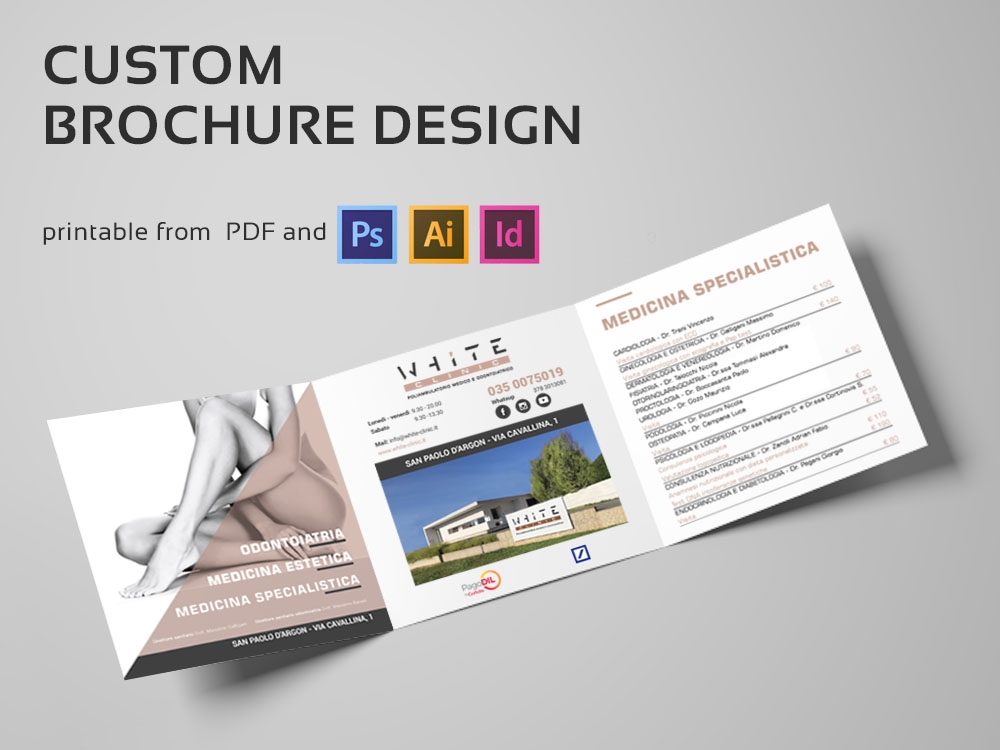
Brochure layout design involves arranging text, images, and graphics in a way that effectively communicates your message. This process ensures that all elements work together harmoniously to engage the reader and convey information clearly.
Key Elements of a Successful Brochure Layout
Balance and Alignment
Firstly, balance and alignment are crucial. A well-balanced design ensures that no part of the brochure feels too heavy or cluttered. Alignment helps create a clean, organized look that guides the reader through the content.
Hierarchy and Flow
Secondly, establishing a clear hierarchy and flow is essential. By prioritizing information and using headings and subheadings effectively, you can guide the reader’s eye through the brochure seamlessly.
Color and Typography
Lastly, the use of color and typography can make or break your design. Colors should complement your brand and evoke the desired emotions, while typography must be legible and align with the overall aesthetic.
Creating a Smooth Flow
Furthermore, transition words create a natural flow from one section to the next. This is particularly important in brochure design, where you want to keep the reader engaged from the cover to the back page.
Elements of an Effective Brochure Layout Design
Cover Page Design
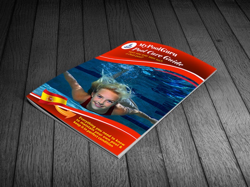
After all, the cover page is the first thing your audience will see, so it needs to be striking and informative. A compelling headline, engaging image, and clear branding can make a strong first impression.
Inside Pages
Content Organization
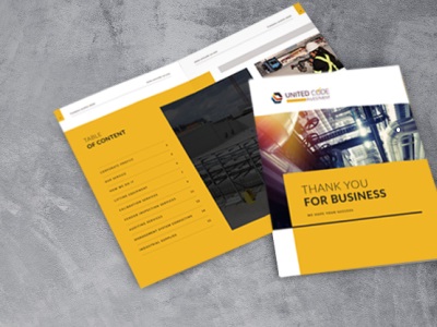
Another key point: when it comes to the inside pages, content organization is key. Use headings, subheadings, and bullet points to break up text and make it more digestible.
Visual Appeal
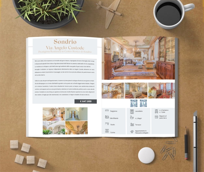
Moreover, visual appeal is crucial. As can be seen, high-quality images and graphics can enhance the overall look of your brochure and make the information more engaging.
Back Cover
Lastly, the back cover should include a call to action, contact information, and perhaps a final thought or quote to leave a lasting impression.
Guiding the Reader’s Eye
Moreover, these words guide the reader’s eye from one part of the brochure to another, ensuring that the flow of information feels natural and logical.
Making Information Digestible
In addition, transition words break down complex information into smaller, more manageable parts, making the content easier to understand and remember.
Designing with a Purpose
Identifying Your Target Audience
Understanding who you are designing for is the first step. As shown above, tailor your design and content to meet the needs and preferences of your target audience.
Setting Clear Objectives
Furthermore, set clear objectives for your brochure. Whether it’s to inform, persuade, or entertain, having a clear goal will guide your design choices.
Crafting a Compelling Message
Lastly, craft a compelling message that resonates with your audience. Use persuasive language and strong visuals to convey your key points effectively.
Steps to Create a Stunning Brochure Layout Design
Initial Planning and Research
Start with thorough planning and research. Understand your audience, objectives, and the message you want to convey.
Sketching the Layout
Next, sketch out your layout. This can be a simple pencil drawing or a digital mockup. The goal is to visualize the placement of different elements.
Choosing the Right Fonts and Colors
Moreover, choose fonts and colors that align with your brand and the brochure’s purpose. At the same time, ensure that they complement each other and enhance readability.
Incorporating Images and Graphics
In addition, incorporate high-quality images and graphics that support your message and add visual interest.
Balancing Text and Visuals
Avoiding Clutter
One key aspect is avoiding clutter. Too much text or too many images can overwhelm the reader. Strive for a clean, balanced look.
Ensuring Consistency
Consistency is also crucial. Use the same fonts, colors, and styles throughout the brochure to create a cohesive design.
Highlighting Key Information
Moreover, highlight key information using bold text, different colors, or other visual techniques to draw attention to important points.
The Role of White Space
Improving Readability
By all means, white space, or negative space, improves readability by giving the reader’s eyes a break and making the text less dense.
Creating a Clean Look
Additionally, white space creates a clean, modern look that enhances the overall design.
Enhancing Visual Hierarchy
In addition, it enhances visual hierarchy by helping to separate different sections and emphasize important elements.
Optimizing for Print and Digital
Print Considerations
Paper Quality
For print brochures, paper quality matters. By the time, choose a durable, high-quality paper that feels good to the touch and enhances the design.
Printing Techniques
Moreover, consider different printing techniques such as embossing, foil stamping, or spot UV to add a unique touch.
Digital Considerations
Interactive Elements
For example, for digital brochures, interactive elements like clickable links, videos, and animations can enhance user engagement.
Accessibility
Additionally, ensure that your digital brochure is accessible to all users, including those with disabilities. Use alt text for images and ensure that text is readable.
Common Mistakes to Avoid
Overloading with Information
For this reason avoid overloading your brochure with information. Keep the content concise and to the point.
Poor Font Choices
Moreover, poor font choices can ruin your design. Use legible fonts that match the tone of your message.
Ignoring Brand Consistency
Additionally, ignoring brand consistency can confuse your audience. Ensure that your brochure aligns with your overall brand identity.
Reviewing and Testing Your Design
Getting Feedback
For instance, once your design is complete, get feedback from colleagues or focus groups to identify any areas for improvement.
Making Revisions
Moreover, be prepared to make revisions based on the feedback received.
Final Proofing
Lastly, conduct a final proofing to catch any errors before printing or publishing.
Hiring a Professional Brochure Layout Design Service
Benefits of Professional Services
For this purpose, hiring a professional design service can save you time and ensure a high-quality result. Professionals bring expertise and a fresh perspective to your project.
What to Look for in a Designer
When hiring a designer, look for experience, a strong portfolio, and good communication skills.
Cost Considerations
Additionally, consider the cost. While professional services can be more expensive, the investment is often worth it for the quality and impact of the final product.
Showcasing Your Brochure
Distribution Strategies
Effective distribution is key to getting your brochure into the hands of your audience. Consider mailing, handouts at events, or placing them in strategic locations.
Measuring Success
Moreover, measure the success of your brochure by tracking responses, engagement, and feedback.
Collecting Feedback
Lastly, collect feedback to understand what worked well and what could be improved for future projects.
Conclusion
In conclusion, a well-designed brochure can be a powerful marketing tool. By incorporating transition words, you can enhance readability and engagement, making your brochure more effective. Remember to focus on balance, visual appeal, and clear communication to create a brochure that stands out.
FAQs
What is the average cost of brochure design services?
In a word, the cost can vary widely based on the complexity of the design and the experience of the designer. On average, it ranges from $200 to $800.
How long does it take to design a brochure?
The time frame can vary, but typically it takes anywhere from one to four weeks from initial concept to final proofing.
Can brochures be used for digital marketing?
Absolutely! Digital brochures can be shared via email, social media, or your website, expanding your reach significantly.
What are the most common sizes for brochures?
Common sizes include 8.5” x 11”, 8.5” x 14”, and 11” x 17”. The size you choose depends on the amount of content and the design layout.
How can I ensure my brochure stands out?
To ensure your brochure stands out, use high-quality images, engaging content, and a unique design. Consider hiring a professional designer to achieve the best results.


Reviews
There are no reviews yet.